December 08, 2006
Proof by projector
I've always been interested in how a choice of medium effects how a particular message is sent. How does one capitalize on the strengths and weakness of a particular medium. What makes a great Powerpoint, brochure, website, flyer, etc.. It started at work when I was given printed information that people wanted put up on the website. That often would involve rewriting the copy or designing a new layout that be most comfortable on the web.
I also started thinking about this in my Calc class. As students, we had to write up our proofs on transparencies and place them on the overhead projector when sharing our answers. This was to save time from wrting out the problem on the board because some of the results were quite lengthy. I started out writing the proofs on transparency just as i would type it if i were to turn it in. Through the semester i learned that it seems to more more difficult to understand a proof projected on a wall than one that you can hold in your hand. I wondered if there was a better way to present a proof in the medium of transparencies versus a text-only written proof.
I thought i would share my experiment. I typed up a proof for my notes and also made a transparency with the same result. We had to prove that the limit of x2 as x approaches a is a2. With the typed version i used the same style i would if i had to turn in the proof for a grade. With the transparency version, i tried to use color and design to highlight the important ideas of the proof. It's much easier to draw pictures on a transparency so i tried to take advantage of that opportunity. I tired to make it less wordy. I wanted something that could be quickly digested.
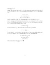
In the end, i'm not sure which method is more effective (but i do know which was more fun to do). Now that the class is over i'll never have to make another transparency again. I suppose i'll let someone else worry about what makes a transparency effective.
Posted by Matthew at December 8, 2006 04:47 PMHahaha... the colorful transparency is MUCH better! Nice job on the travel theme -- I especially enjoyed the "thumbs-up-dude" at the end.
Posted by: Jeff at December 11, 2006 10:04 PMThanks. Considering my lack of artistic abilities i was happy with how it turned out.
Posted by: Matthew at December 12, 2006 11:01 PMComputer Modern Font? Check. Nicely justified Paragraphs? Check. Math equations look like they should? Check. I detect TeX or some TeX-based tool, in any case, still the best way to typeset math. TeX output has an austere beauty of it's own. It was designed for displaying formal math clearly and gracefully by a guy who loves math. TeX was intended for exactly this sort of task. The print is clean, formal and elegant.
Your handwritten transparency is way outclassed in many catagories from the outset, but you proceed to blow away your print version in charm and humor and humanity. The abstraction of proof is expressed through a story/metaphor. One (such as myself) doesn't understand the math, but knows exactly what's going on. Nice work!
Posted by: William Clifford at December 14, 2006 06:26 AM